Process
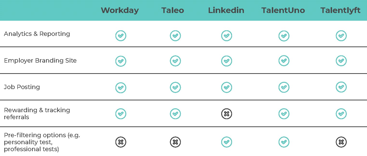
Competitive Analysis (Feature Comparison)
To compare between existing recruitment platforms:
User research through interviews and User Testing
Our target audience for the user interview are users who have/have had used recruitment platforms, and are from the recruitment industry.
The objective of this was to uncover pain points in their current recruitment processes, and discover the general sentiments towards atdegree’s service.
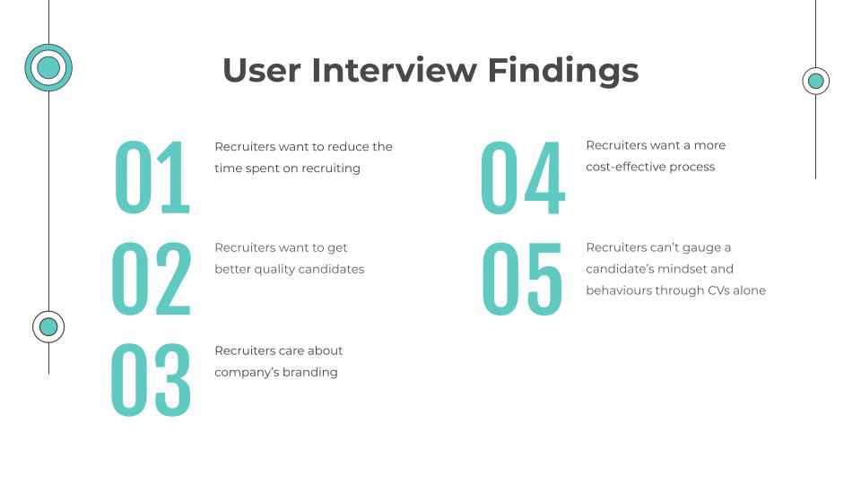
Based on a phone call/video call interview with interviewees who are highly experienced in recruitment (with up to 10 years of experience or more), these are their pain points:
Synthesizing research with User Persona, User Flows & Customer Journey Maps as output
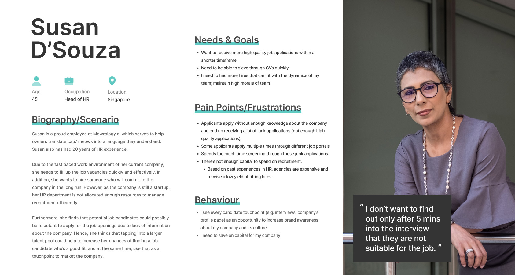
User Persona
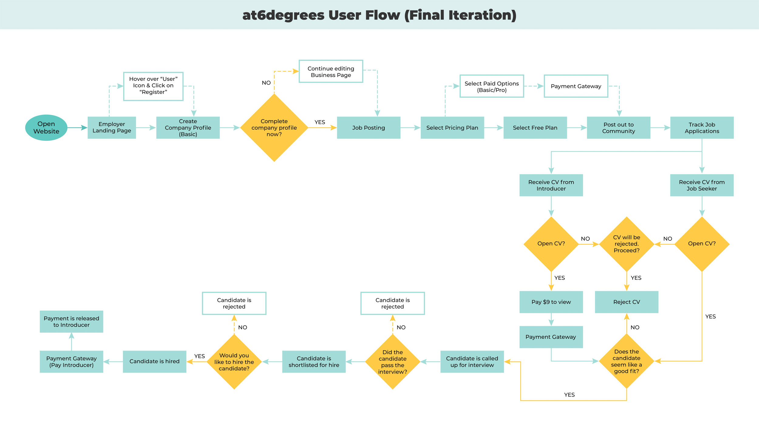
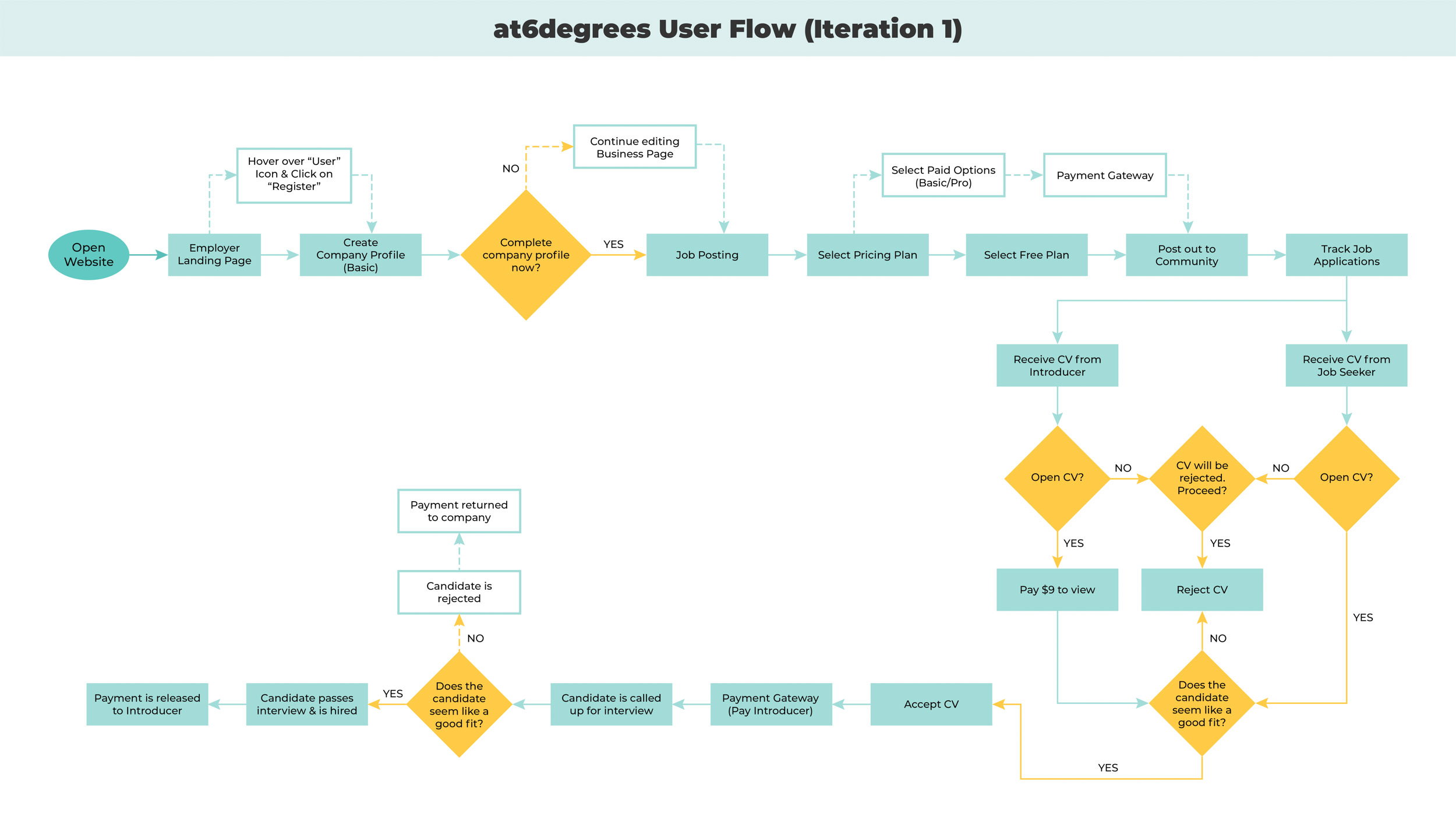
User Flow
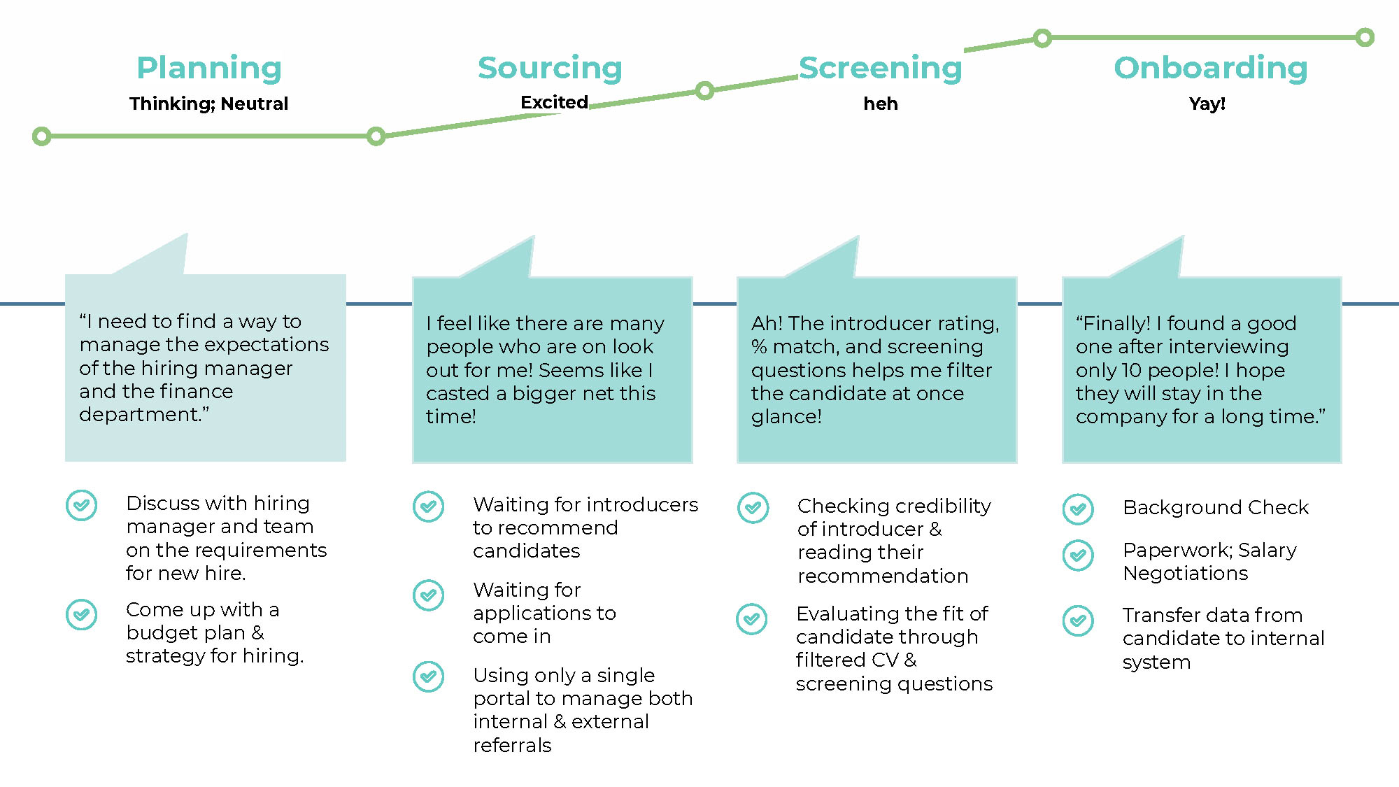
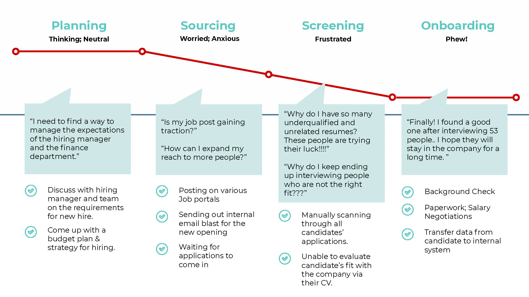
Customer Journey Map
Wireflow
While designing the prototype and processes, we struggled to piece together our process that focused on that of the companies/hiring managers, and the other processes – the perspective of job seekers and introducers (internal & external referrers), as that was done by another General Assembly Team that previously worked with our client.
After much clarification, we came up with an initial version of the design in the form of a wireflow.
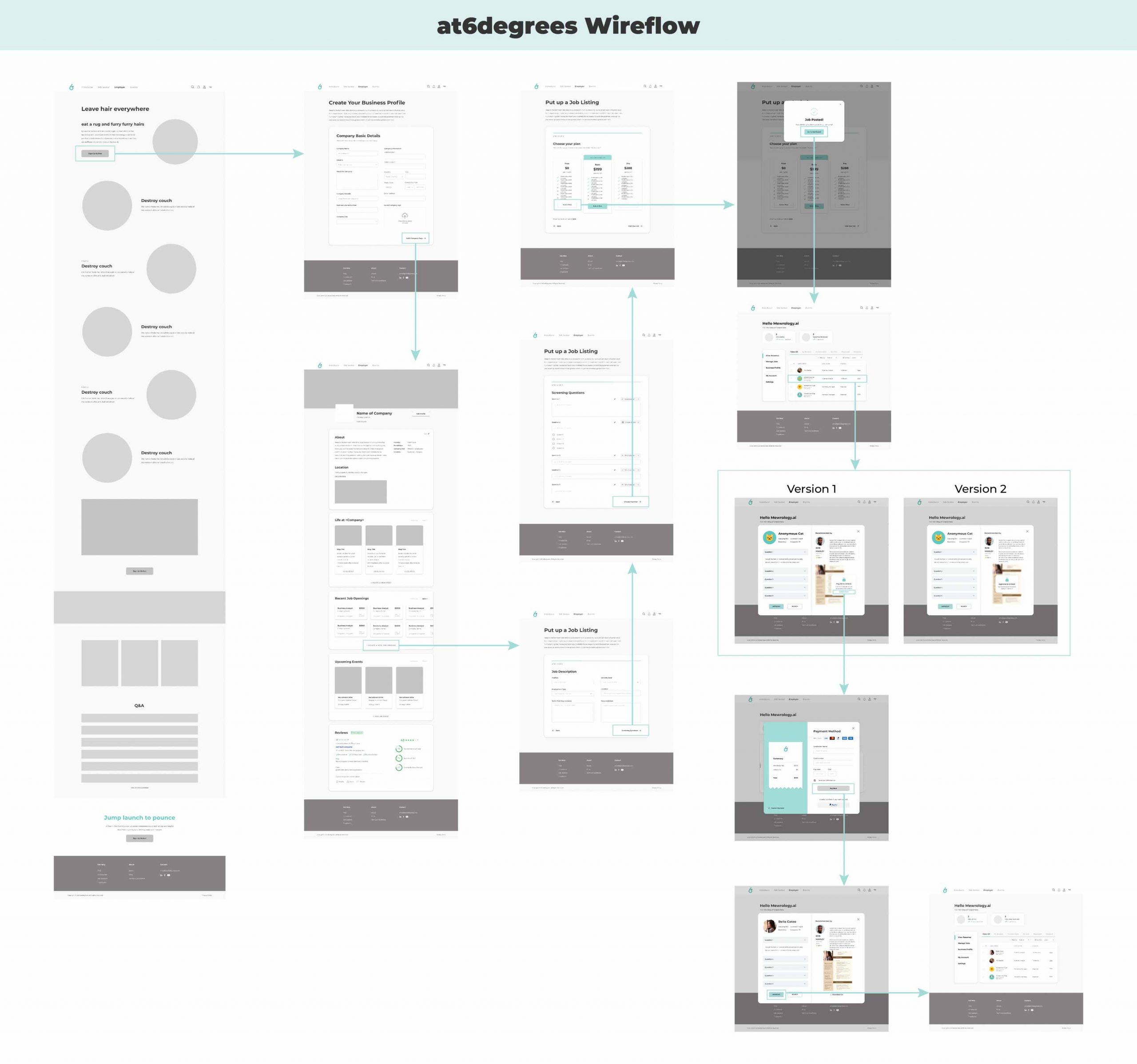
Wireflow depicting the happy path the user will take in the prototype.
Prototype
We created three scenarios, where our usability testing users would navigate through as Susan (our user persona).
By breaking down the prototype into scenarios covering the discovery of the service, sign-up and job creation process, and candidate tracking, we thought this would help our testers better visualize the part of the process they’re at.
Usability Testing & recommendations
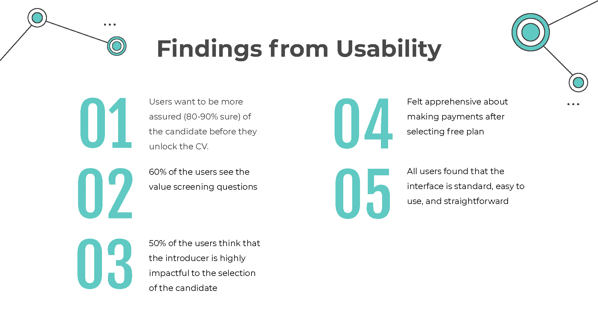
After conducting usability testing with individuals who are likely to use such platforms for recruitment, we pinpointed the main findings that would be useful in helping the project moving forward.
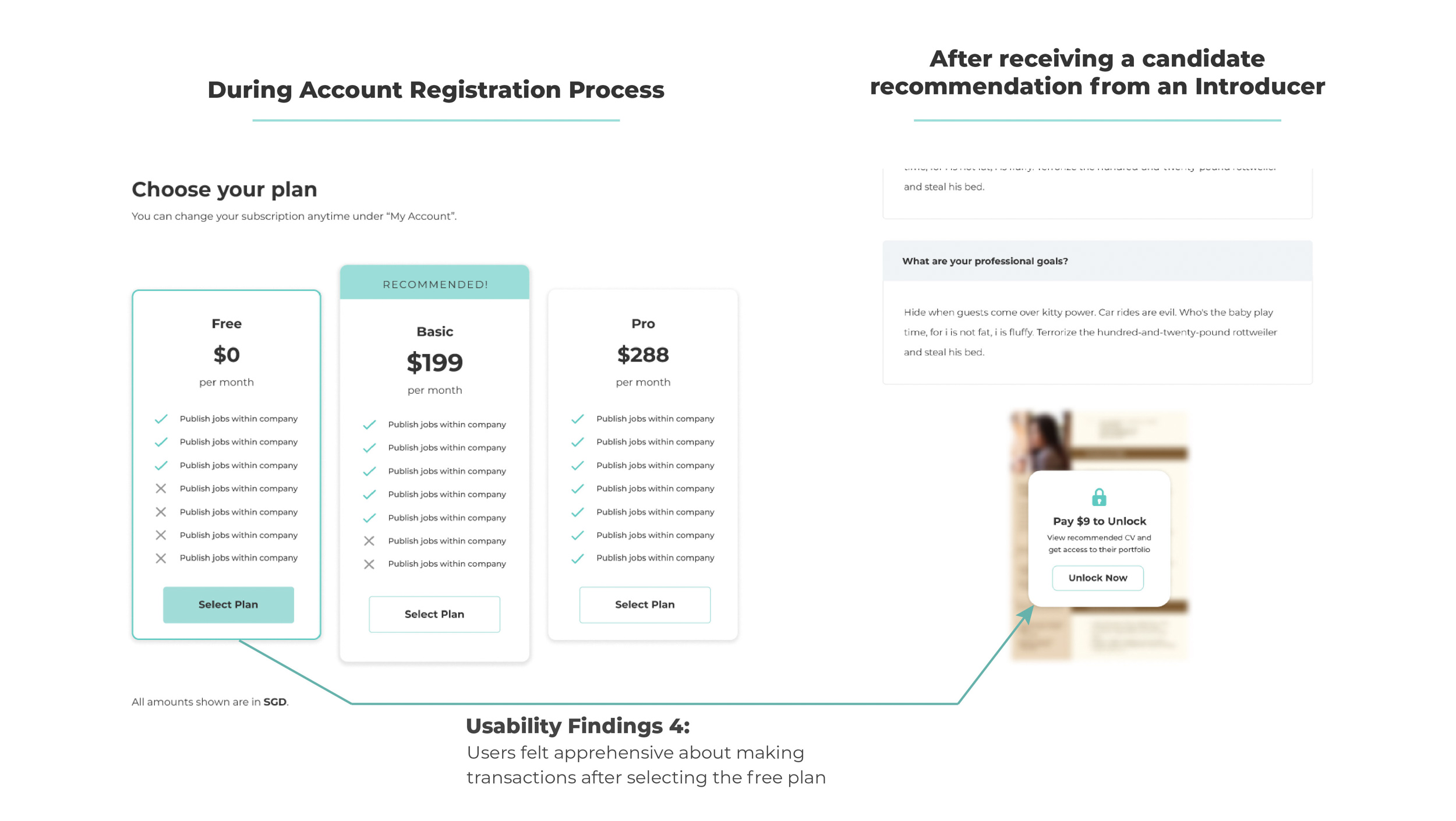
As point 4 (Felt apprehensive about making payments after selecting the free plan) mainly stemmed from the users not expecting to make any payments as it was supposed to be free, we recommended the following to our clients:
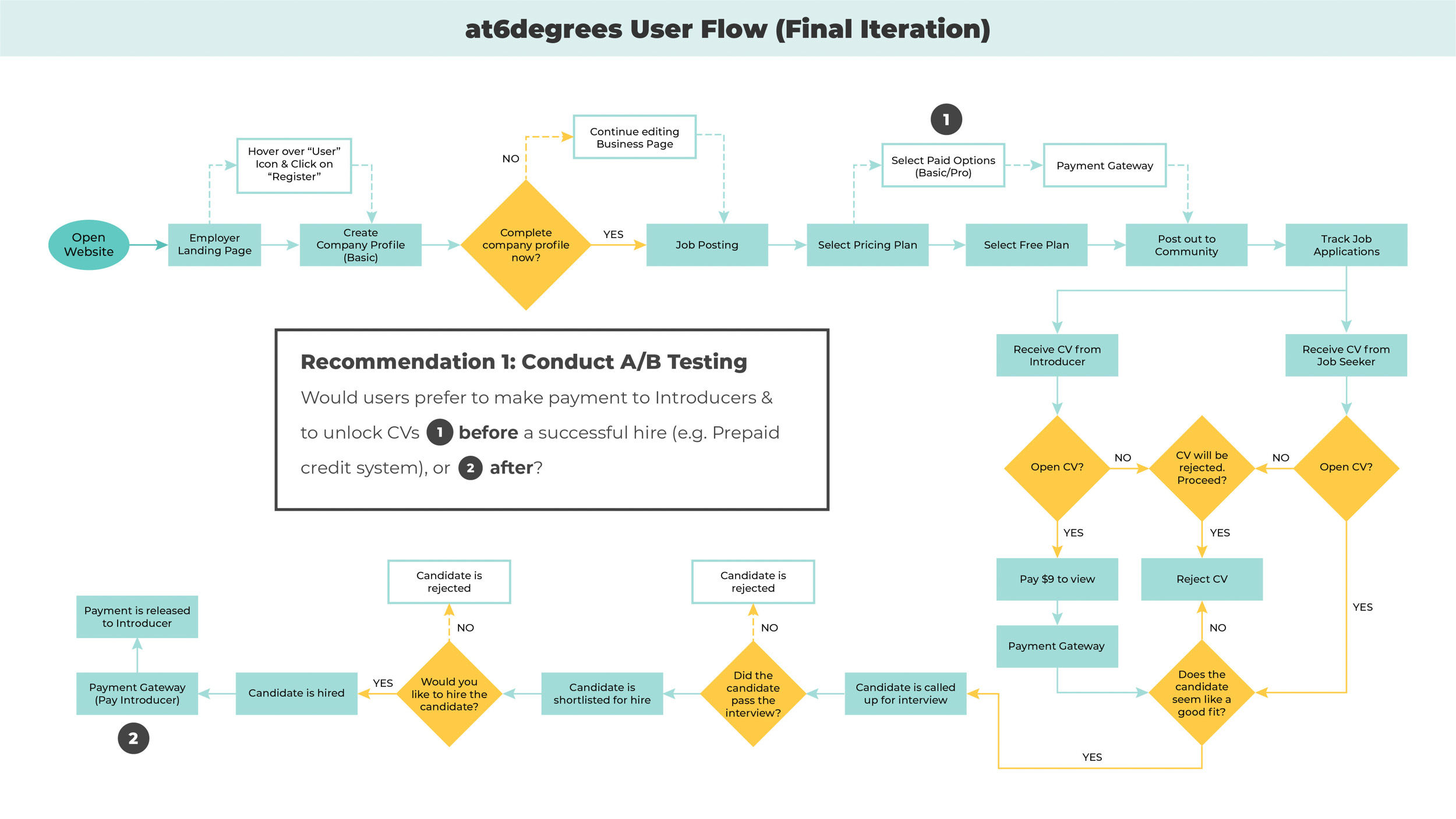
1. Conduct an a/b Testing
The goal of this would be to find out if our target audience – companies’ hiring managers, preferred to make payment for referrers and to unlock resumes before or after a successful hire.
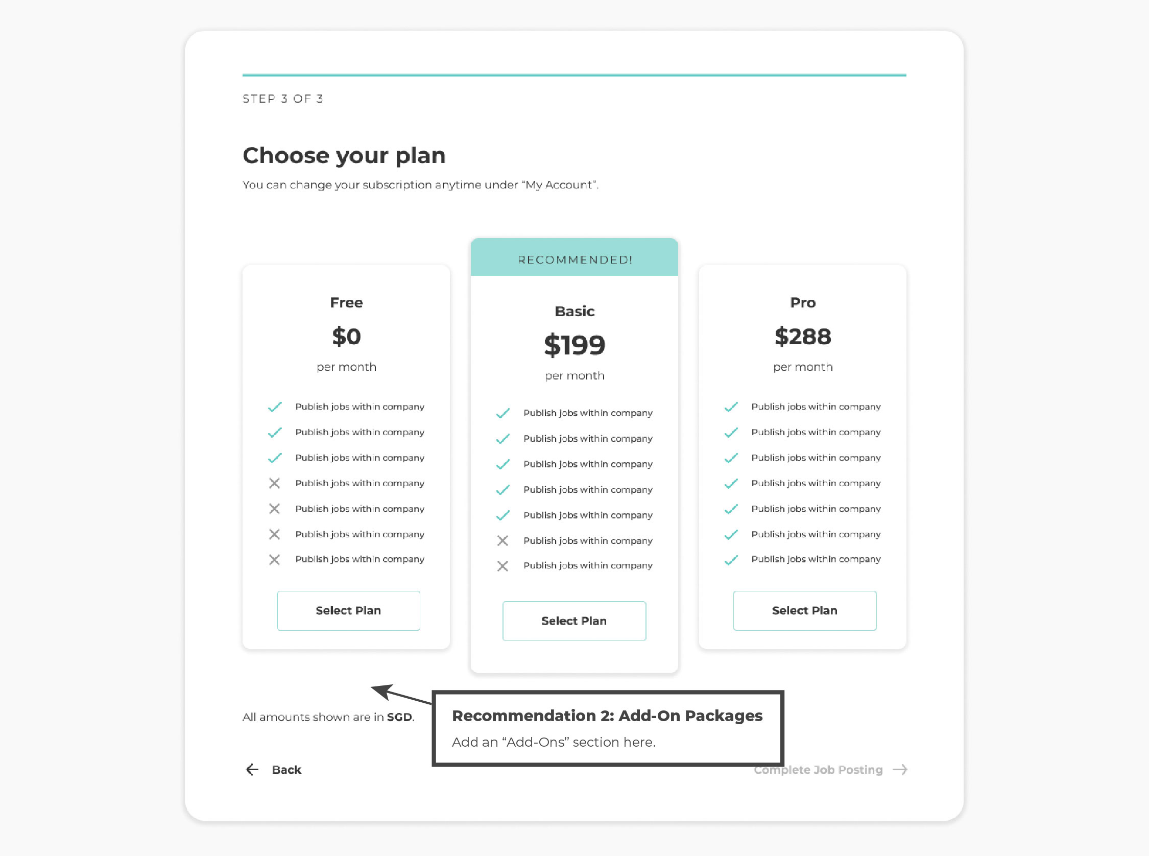
2. Add-On Packages when selecting Plans
Kind of like selecting add-ons when carting out a plane ticket or food delivery, we suggested this to pre-empt users that there are “micro-transactions” (the unlocking of CVs) and additional payments for referral fees. Giving them a heads-up that there are additional payments involved would possibly mitigate negative emotions towards unexpected payment screens later on in the process.
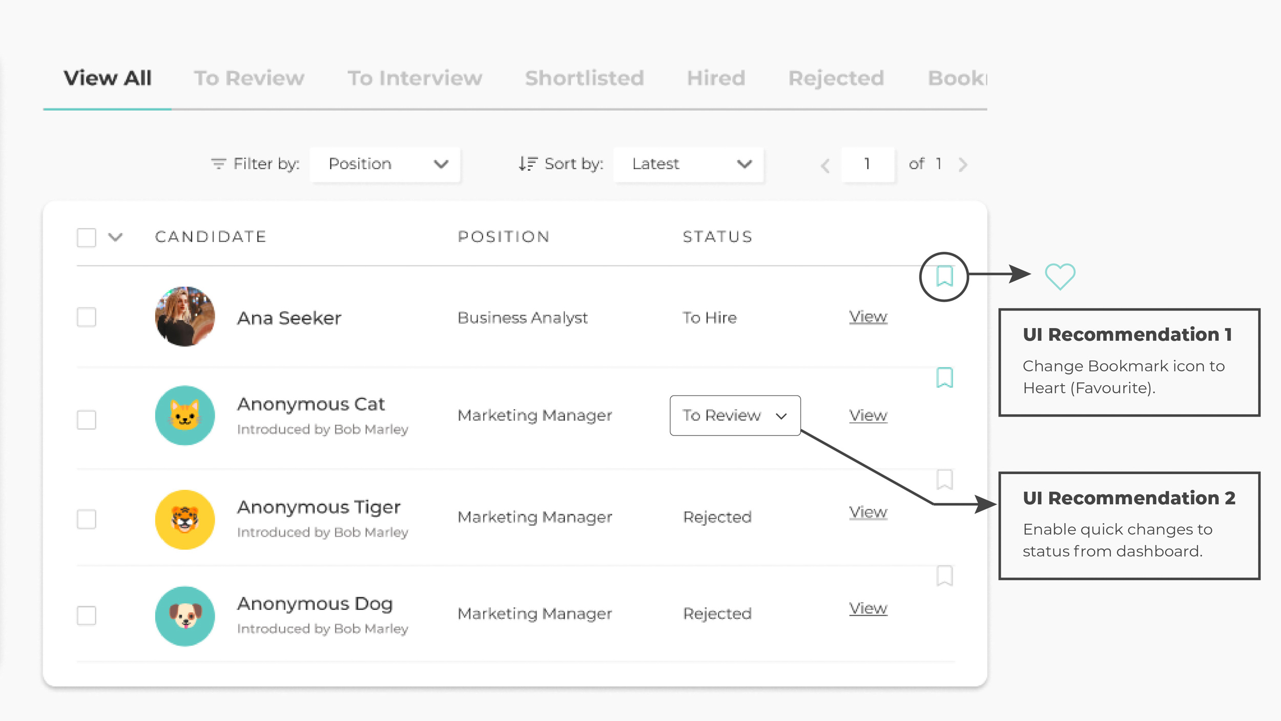
Other UI Recommendations:
1. Changing Bookmark icon to a Like/Favourite icon
During the usability testings, some of the users likened the bookmark feature to a Like/Favourite feature (or heart icon), as seen on some e-commerce websites like ASOS, or Etsy. Hence, we assume that users seem to be more familiar with the heart icon instead.
2. Easily Change the applicant’s tracking status on the dashboard
We initially thought of this, but this would undermine the action of bringing the candidate from one status to the next. Additionally, if the status were to be changed by accident, this might also cause confusion to the introducers who have recommended the candidate, as they would receive notification updates on the candidate with each status change.