
Competitor &
Comparative Analysis
To find out what’s the baseline processes of checking out amongst other local stationery shops and e-commerce platforms, we conducted a competitive and comparative analysis.
This would help us to spot any touchpoints where potential customers may have dropped off, resulting in low numbers of successful checkouts.
We first tasked ourselves to add a pen (any pen, but not apple pen unfortunately), to our cart on the Evergreen website and checkout until just before we had to make any payments.
Competitive Analysis Task: Add a pen to shopping cart and checkout
Comparative Analysis Task: Add an item to shopping bag and checkout
| No. of Steps to Place an Order | |
|---|---|
Evergreen |
15 |
Stationery Brand 1 |
7 |
Stationery Brand 2 |
10 |
Not-a-Stationery-Brand |
11 |
Table 1: Competitive analysis between Evergreen with Stationery Brand 1 & 2,
and Comparative analysis with Not-a-Stationery-Brand
Based on our results, it was clear that placing an order didn’t just feel lengthy, but was actually lengthy relative to competitors. With this data, it further emphasized the need to shorten that process in the prototype.
While navigating the website with a purpose in mind, we encountered some other roadblocks as well:
Usability Issue:
Accessibility Issues
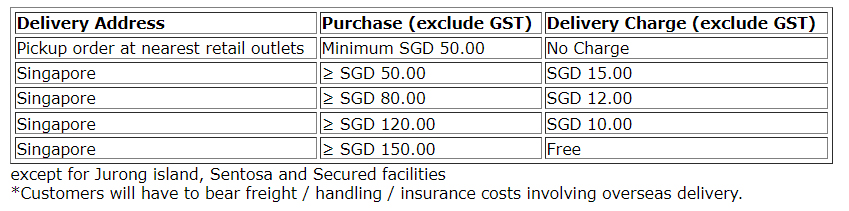
Besides inconsistency in colour use at first glance (random pops of orange and blue), there’s low contrast in colour with some buttons.
We want the website to be accessible to everyone – including those who may be colourblind too. Especially since green is used pretty heavily throughout the site,
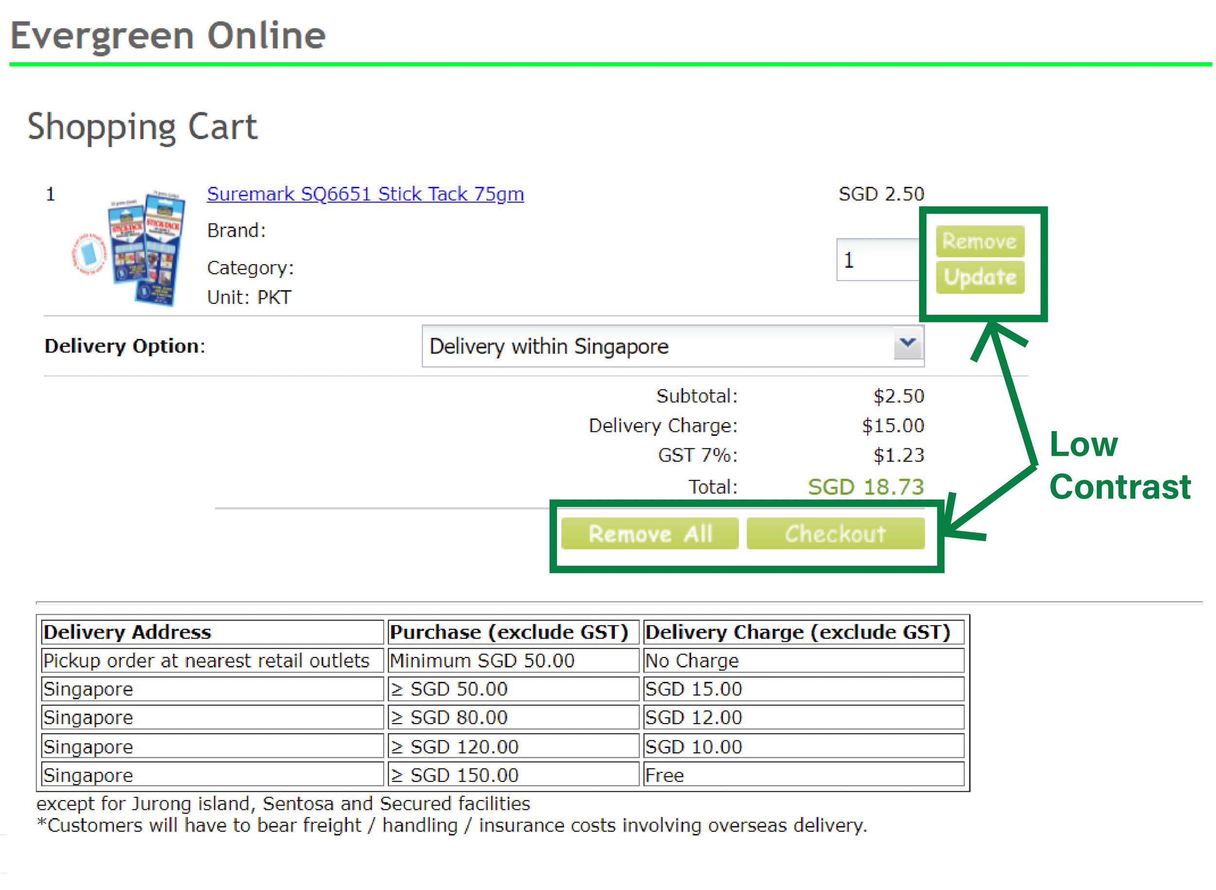
Image 1: Green buttons in shopping cart page has low contrast against its white text.
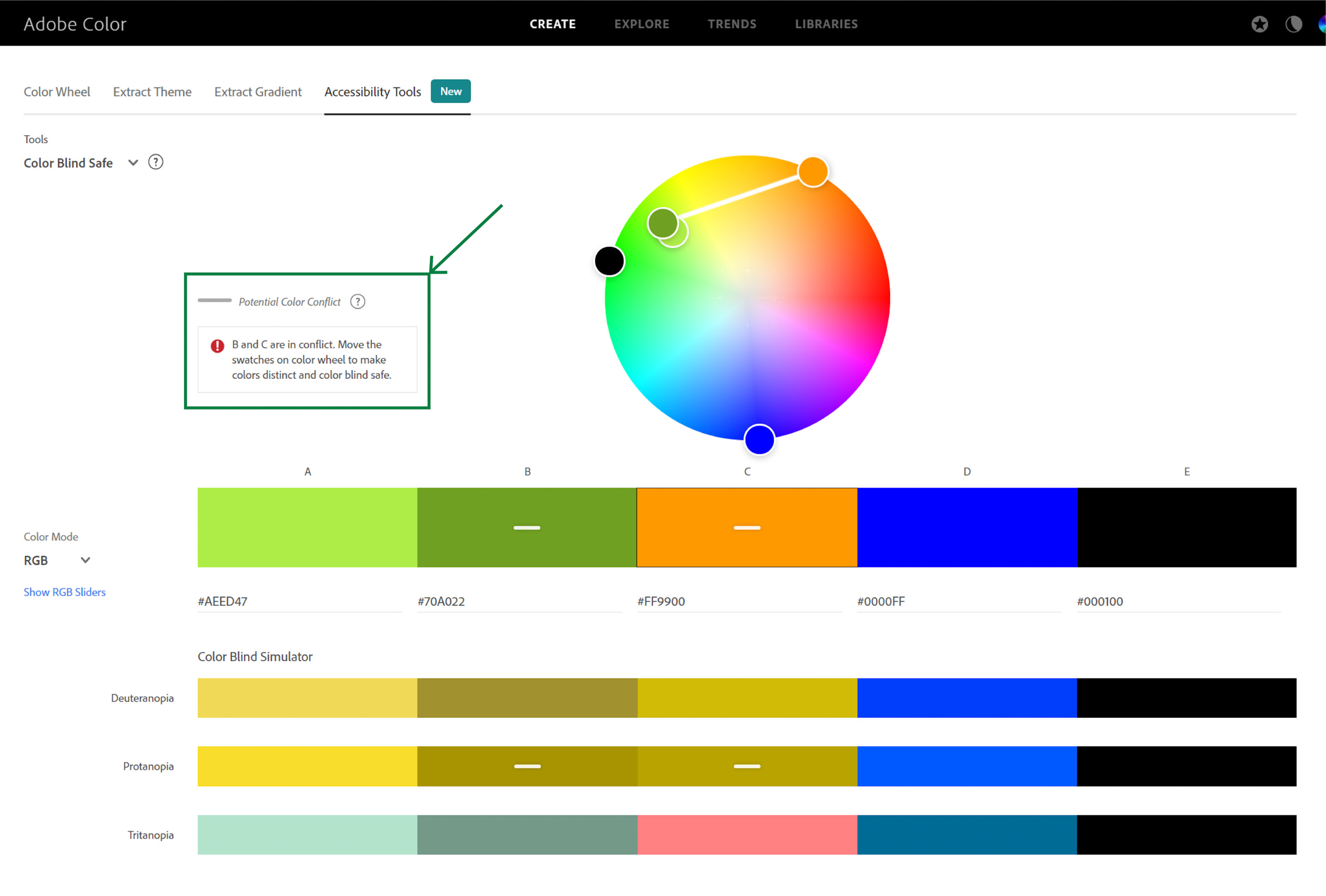
Image 2: According to Adobe Color’s Color Blind Simulator, the shade of green used in some texts and orange are too similar
After analyzing Evergreen Stationery’s website, we had many questions in mind, but more importantly – are the issues we faced consistent with other users, and were there any areas we may have overlooked?
User Interviews &
Usability Testing
We came up with a list of questions for our interviewees that got a gauge of their experience with online shopping in general, and for stationery in particular as well.
At the end of the interview, the interviewees would be tasked to add a pen to their cart and try to checkout (as Melissa and I did in Competitors Analysis).
Our Findings
Adding on to our first usability issue (Dated Website Layout, Design, & Structure) all 5 of the interviewees mentioned that the website is dated, and one even mentioned:
“Website looks like a legacy website with old school fonts and belongs to an era where internet is just a face”
They also mentioned that it needs to be more “visually appealing” and that it “doesn’t stand out from the rest of the stationery shops”.
Usability Issue:
Poor Navigation
Melissa and I too thought it was difficult to navigate around but we wanted to dig a little deeper and ask if others felt the same way too. Here’s what our interviewees said:
A. Inaccessibility of Popular Sections
Choosing the most basic item – a pen, for our interviewees to search for, if they can’t even find a pen easily, then there are definitely some issues that need to be fixed already. And that rang true because they spent quite some time trying to locate the category with pens – i.e. “Writing Materials”.
When we asked them why they look a while to locate it, they mentioned the first thing they would look for is a category named “Pen” before they thought of checking in “Writing Materials”. Furthermore, “Writing Materials” was located all the way at the bottom of the sidebar, adding on to the time spent looking for it.
In hindsight, it would’ve been helped us get a better gauge of the time spent looking for the category if we had timed our participants for this particular section.
B. Too many layers of categories
Even through the search bar, we saw that they expressed frustrations in having to click through multiple layers to get to the product page.
We’d want our webpage visitors to get to what they’re looking for ASAP, so we also decided we’ll definitely simplify this process for the prototype.
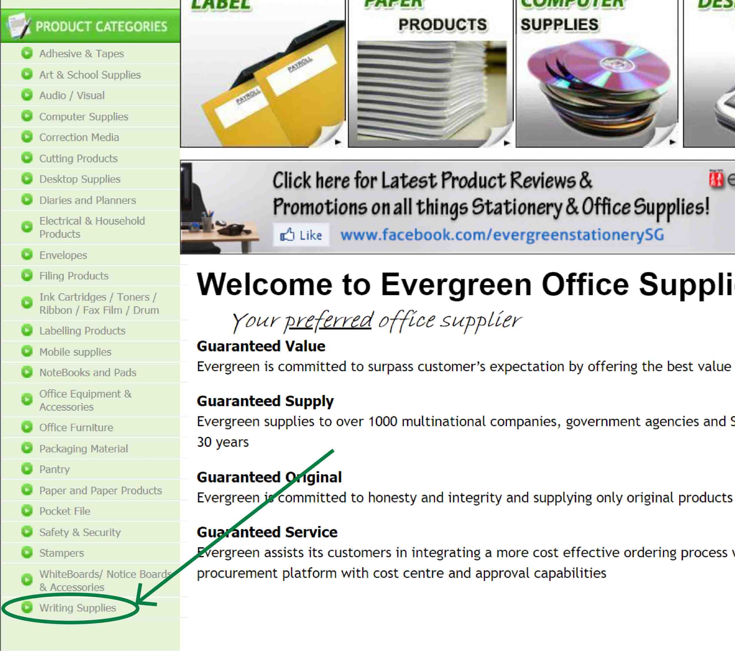
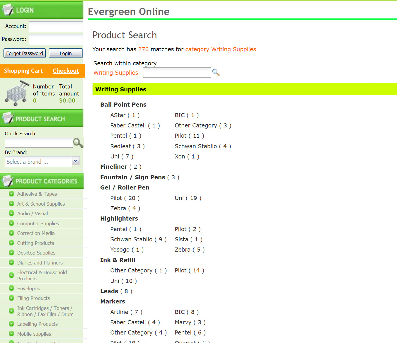
Image 3: “Writing Supplies” (which we assume is a popular category) is located at the bottom of the menu.
Image 4: After clicking on “Writing Supplies”, users are brought to this page where they have to select a brand under a category to access the products page.
Usability Issue:
Missing Information
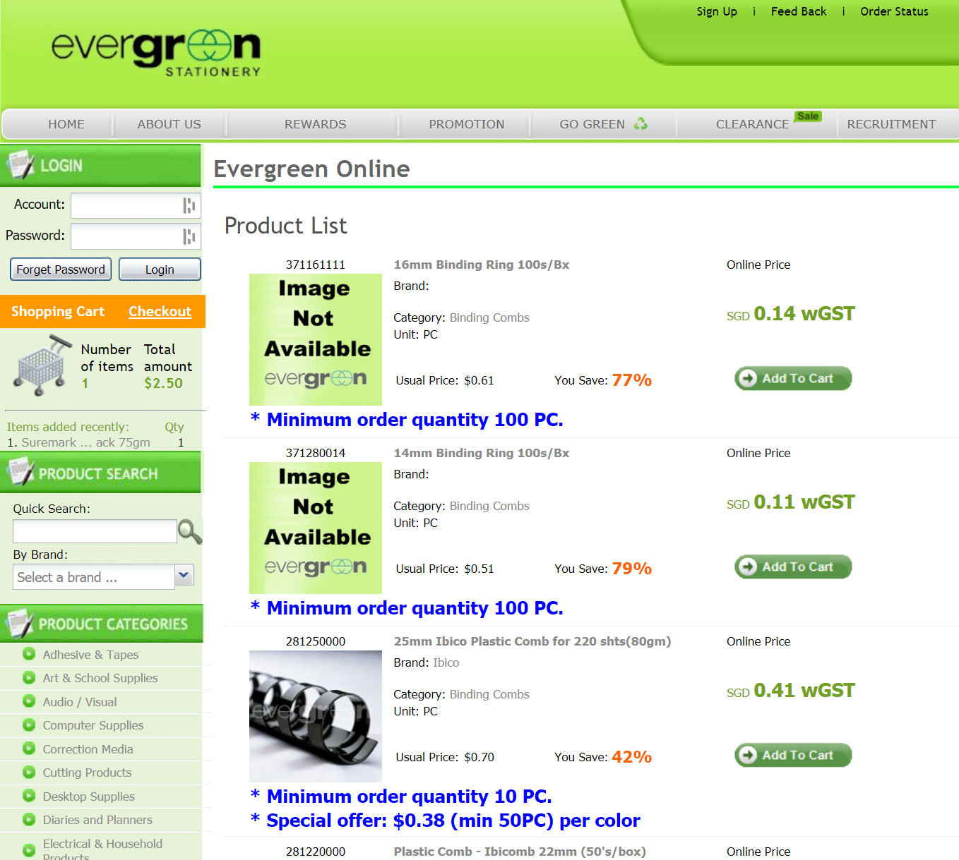
Some of our interviewees questioned why the product images were not available, and why some pages were empty (e.g. Promotions, & Clearance) as well.
We reckon that on top of the design, the website’s content too, have not been updated in a long time.
Usability Issue:
Creating an account shouldn’t be necessary to checkout
According to our interviewees, the act of creating an account to checkout deters them from proceeding with the purchase – probably also another explanation for the low numbers of successful checkouts.
Some reasons why they don’t want to create an account:
- No loyalty benefits
- No thoughts of returning to the website
- Security concerns – they don’t want to give up their personal information if they don’t deem the site as secure.
In these cases, checking out as a guest should be an option that’s open to them as well.
Addressing the Issues
When Melissa and I went over our findings, we thought our first order of business is to restructure the website’s navigation (i.e. restructuring their Information Architecture).
We decided to make the current sidemenu (Product Categories) our new main menu, but since it would be too long to fit on top, we had to find a way to re-categorize Evergreen’s inventory.
And to do that, we decided to conduct an Open Card Sort.
1. Re-Categorizing Products
Addressing Usability Issues:
– Difficulties Navigating
– Ambiguous & Unintuitive Product Categories
We got the help of 5 individuals to group each product category into bigger categories of their own, with their own naming conventions.
Usability Issue:
Ambiguous & Unintuitive Product Categories
As Melissa and I conducted this test, we found that even the names of the product categories were confusing to our participants.
The one that gave us and the participants the most cognitive dissonance was the fact that “Safety & Security” included not just locks and safes, but also First Aid Kits. We didn’t expect “safety” to literally be physical safety too.
Taking into account the participants’ rationale for their naming conventions, we renamed the categories and came up with a new sitemap:
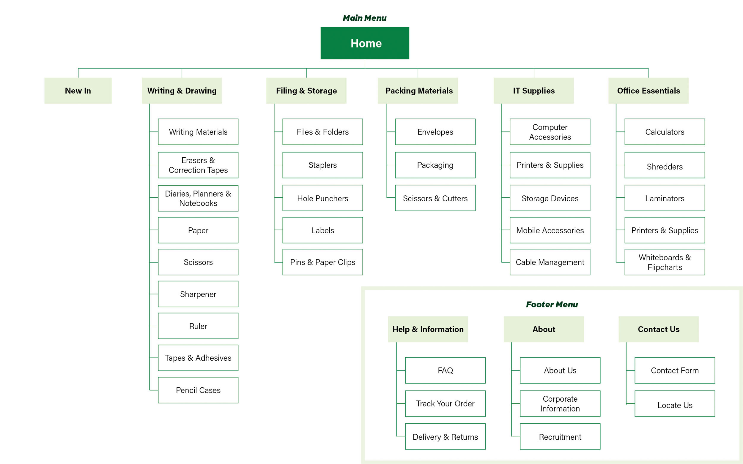
Image 6: Finalized sitemap of the new Evergreen Stationery Prototype
2. Rebranding
Addressing Usability Issues:
– Dated Website Layout, Design, & Structure
– Accessibility Issues
To give the brand a more modern feel, we redesigned their logo, and I chose a new font pairing and a colourblind-safe colour palette for my prototype.
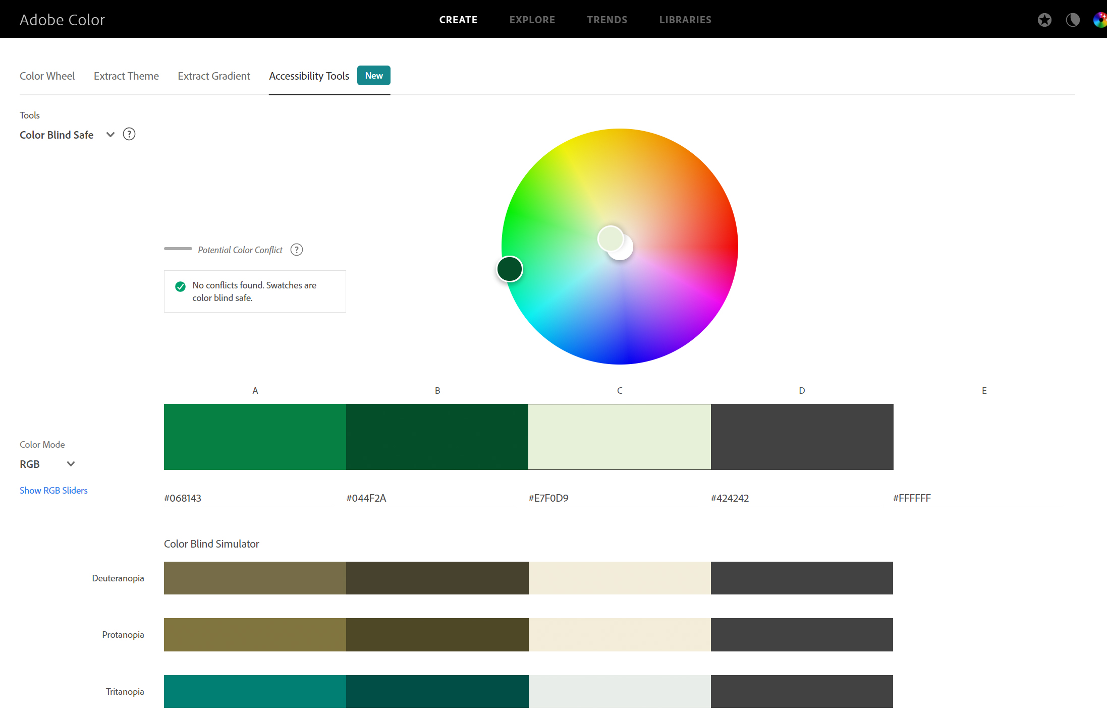
Image 7 (Top): Rebranded Logos & Colour palette
Image 8 (Bottom): New colour palette is colour blind safe based on Adobe Color’s accessibility tool.
3. Prototyping
Addressing Usability Issues:
– Missing Information
– Creating an account shouldn’t be necessary to checkout
As these were more housekeeping issues, we decided to address them as we built our prototypes.
Before doing that, we first created 2 User Personas based on the interviews and usability testings that we held. One of which is a student, while the other, a corporate worker. We chose these two main defining demographics because they had different motivations for visiting a stationery store, and a different range of products they would potentially purchase.
User Personas
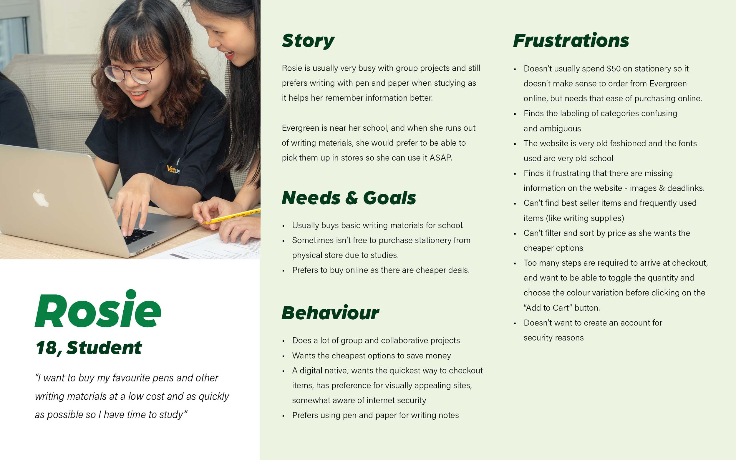
Image 9: Rosie, 18, Student, who wants to opt for pickup but can’t afford the high minimum order requirement to do so.
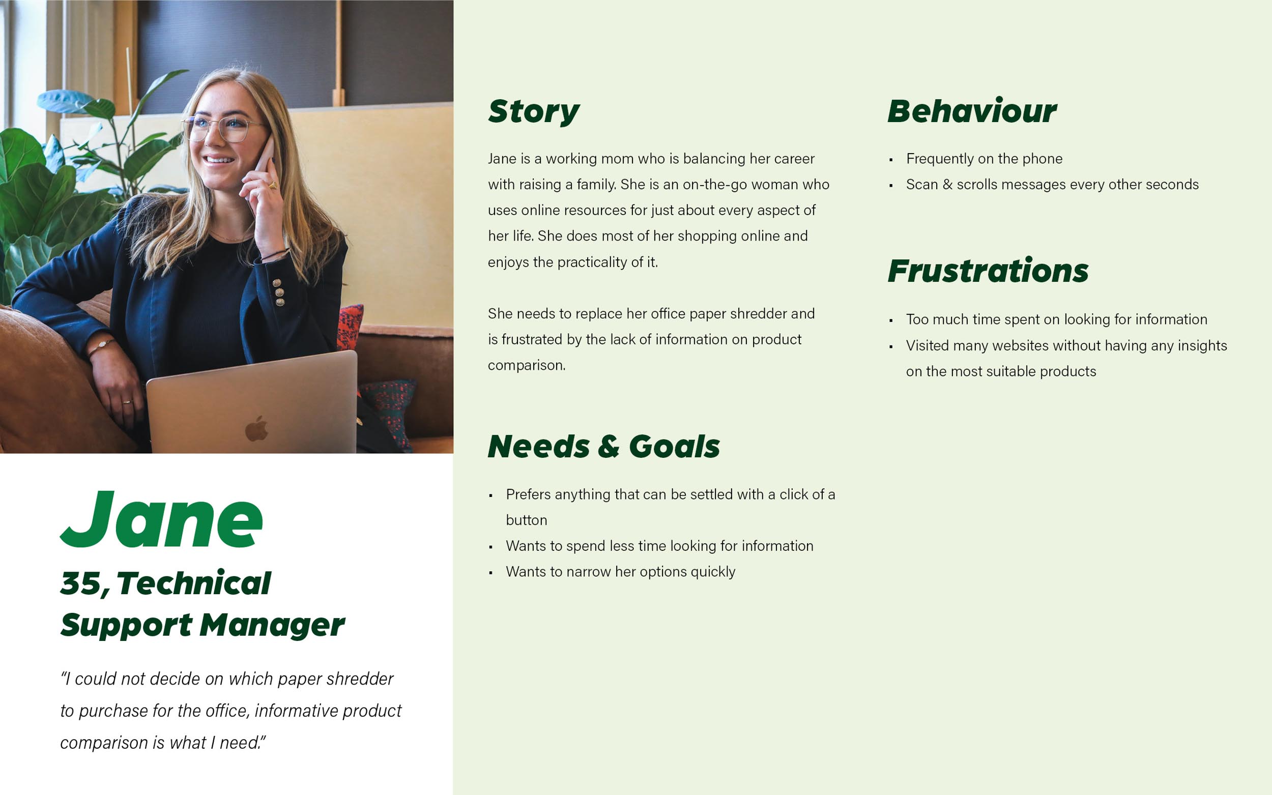
Image 10: Jane, 35, Technical Support Manager, who wants to spend lesser time looking for product information and doing product comparisons.
Problem Statements
Based on these user personas, we came up with problem statements that would highlight the path they would take when navigating through the website (User Flows).
- Rosie needs a way to navigate the website easily and quickly, and be able to opt for store pickup no matter the cost so that she can check out efficiently.
- Jane need a way to find informative product comparison so that she can decide which product is the most suitable for her office use.
How Might We?
Some questions that guided us in the designing of user flows and prototype:
- How might we ensure that users can navigate through an extensive list of categories easily?
- How might we provide users with the option to opt for either delivery or pickup (depending on their preferences)?
- How might we allow users to compare product specifications?
- How might we create a website that simplify browsing, finding information and buying?
Userflows
In both userflows, users will be able to easily access the products page corresponding to their interests (Rosie – Pen, Jane – Shredder) within a few clicks. They will also be able to quickly add items to their cart or checkout immediately.
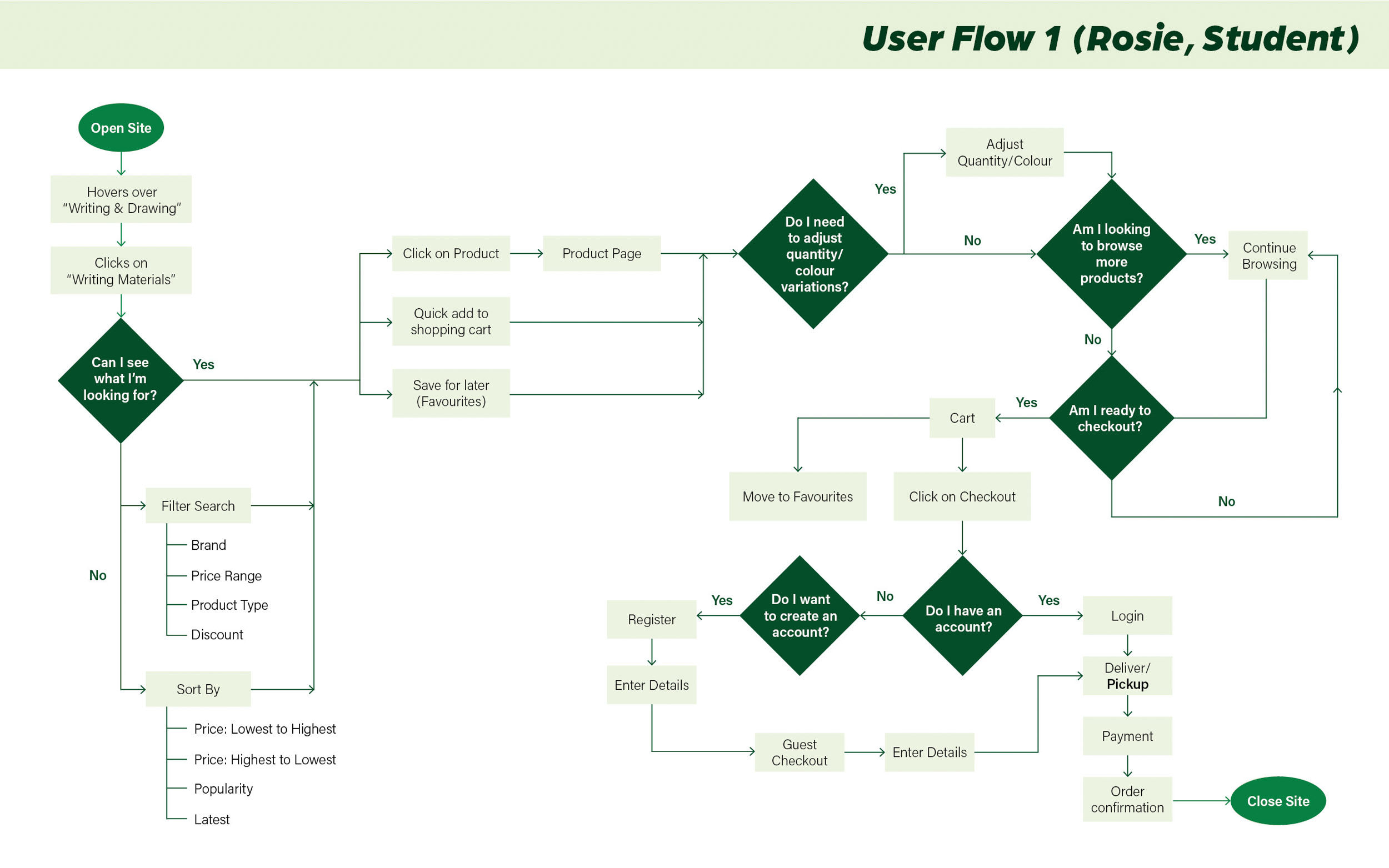
Image 11: User flow of Rosie (Student), minimum order requirement for pickup will be removed, and corresponding delivery prices will be added to the prototype. Rosie will be opting for pickup in the prototype as well.
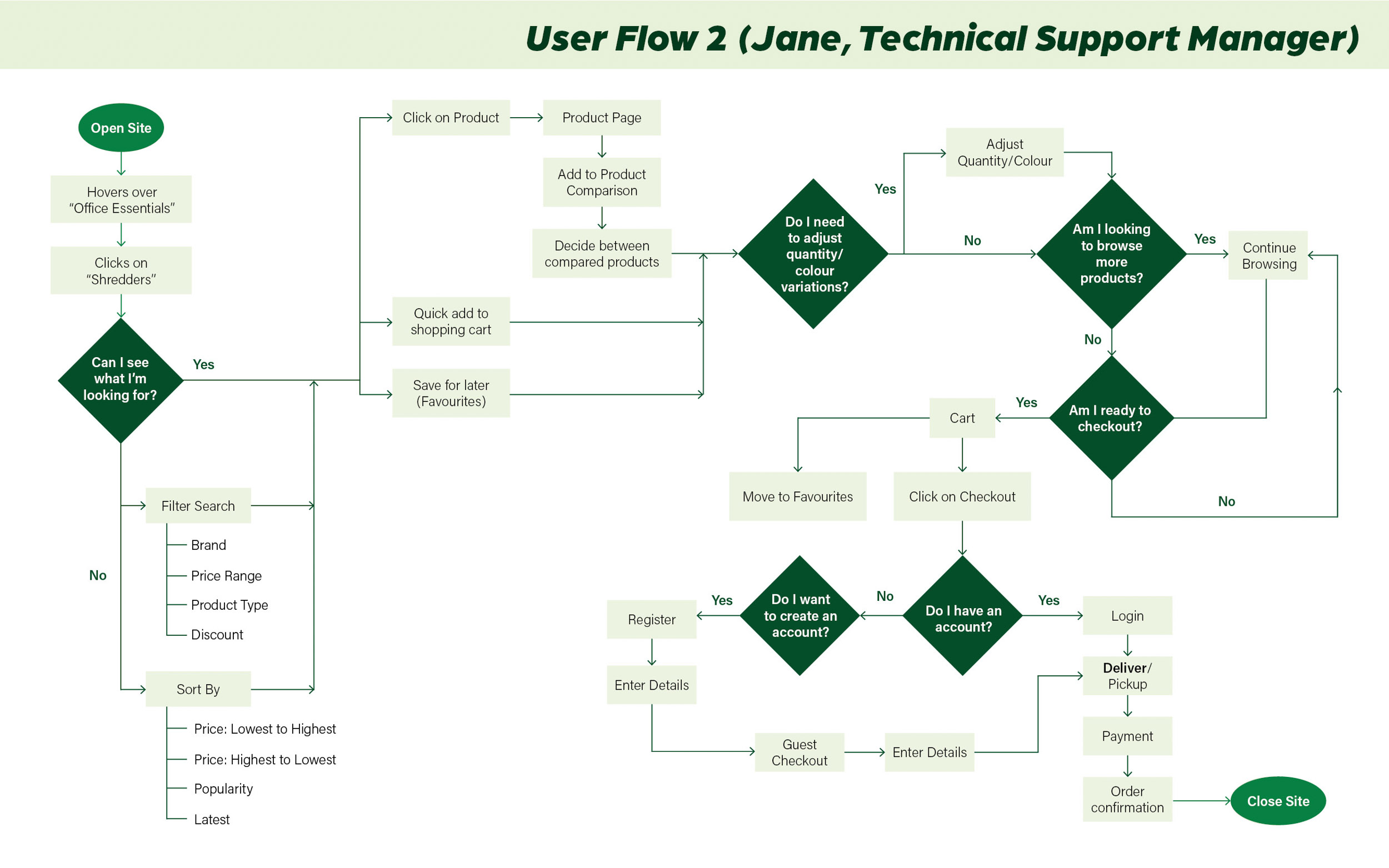
Image 12: User flow of Jane (Technical Support Manager), Jane will have an additional step of comparing between different shredders before checking out with delivery.